
Color Psychology in Home Decor: Choosing Prints That Transform Your Mood
Share
Color Psychology in Home Decor: Choosing Prints That Transform Your Mood
The colors surrounding us have a profound impact on our emotions, energy levels, and overall well-being. When selecting wall art and prints for your home, understanding color psychology can help you create spaces that not only look beautiful but also support the mood and atmosphere you want to cultivate in each room.
The Science Behind Color and Mood
Color psychology is rooted in both science and cultural associations. Different wavelengths of light trigger various responses in our brains, affecting everything from our heart rate to our creativity levels. While individual responses can vary based on personal experiences and cultural background, certain colors consistently evoke similar emotional responses across populations.
How Colors Affect Us Physically:
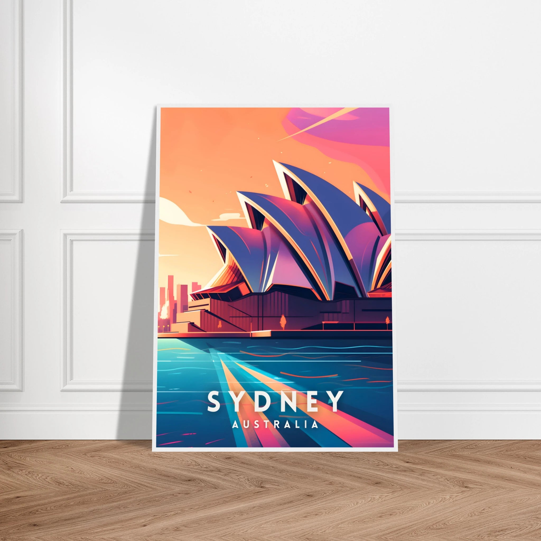
- Warm colors (reds, oranges, yellows) can increase heart rate and energy
- Cool colors (blues, greens, purples) tend to lower blood pressure and promote calm
- Bright colors stimulate the nervous system
- Muted tones create a sense of sophistication and tranquility
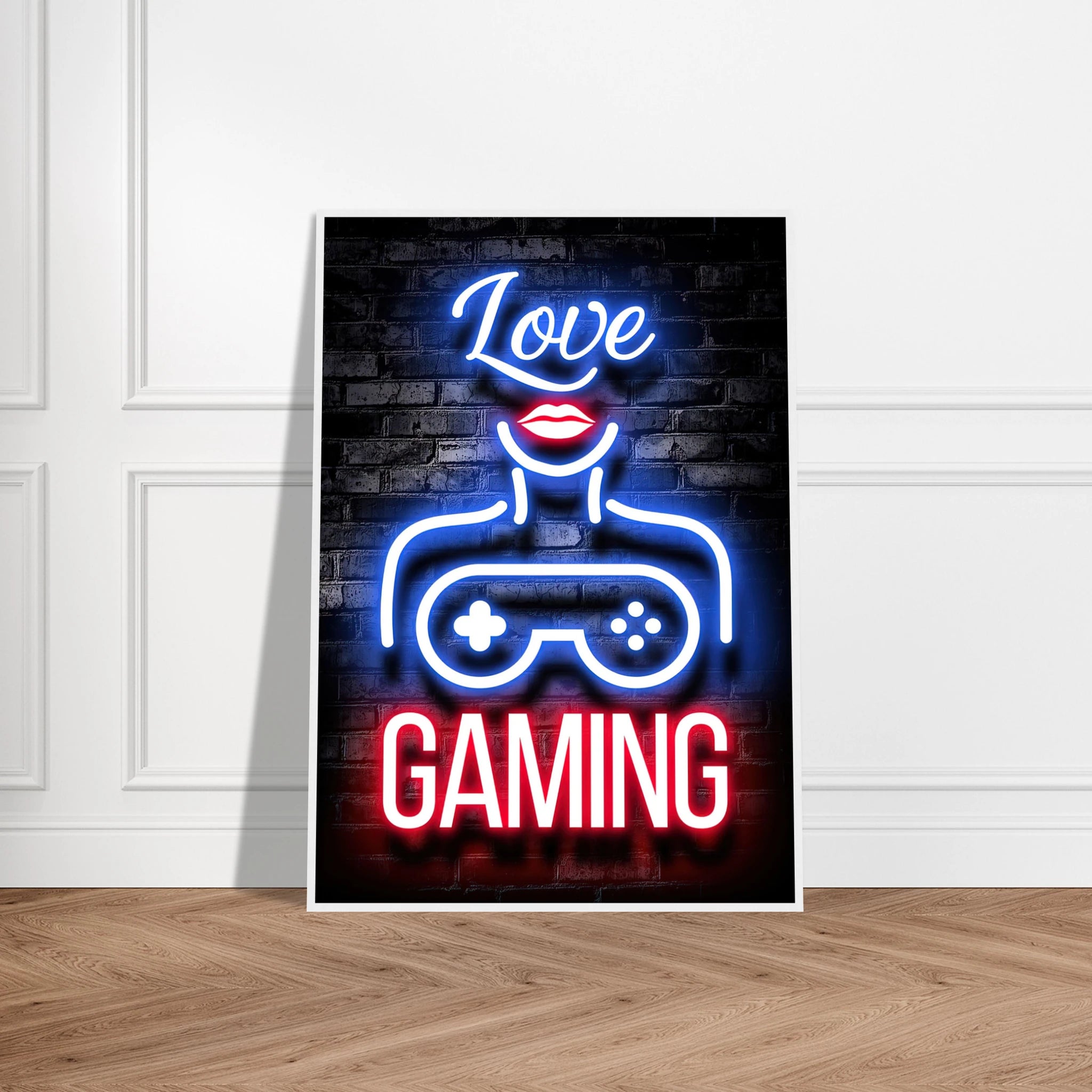
Red: Passion, Energy, and Warmth
Red is the most emotionally intense color, evoking feelings of passion, excitement, and energy. It's also associated with warmth and comfort, making it excellent for social spaces.
Psychological Effects of Red:
- Increases appetite (perfect for dining rooms)
- Boosts energy and conversation
- Can raise blood pressure and heart rate
- Creates a sense of urgency and excitement
Best Rooms for Red Art Prints:
- Dining Rooms: Red artwork stimulates appetite and encourages lively conversation
- Living Rooms: Creates a warm, welcoming atmosphere for entertaining
- Home Gyms: Motivates energy and physical activity
Avoid Red In:
- Bedrooms (too stimulating for sleep)
- Home offices (can increase stress)
- Small spaces (can feel overwhelming)
Red Art Ideas:
- Bold abstract prints with red accents
- Vintage red rose botanical illustrations
- Sunset landscape photography
- Modern geometric designs featuring red elements
Blue: Calm, Trust, and Productivity
Blue is consistently rated as the world's favorite color, associated with calm, trust, and stability. It's known to lower blood pressure and heart rate, making it ideal for relaxation spaces.
Psychological Effects of Blue:
- Promotes feelings of calm and serenity
- Enhances focus and mental clarity
- Can suppress appetite
- Associated with trust and reliability
Best Rooms for Blue Art Prints:
- Bedrooms: Promotes restful sleep and relaxation
- Home Offices: Enhances focus and productivity
- Bathrooms: Creates a spa-like, tranquil atmosphere
- Children's Rooms: Calming influence for better sleep
Different Shades of Blue:
- Navy Blue: Sophisticated and calming
- Sky Blue: Uplifting and peaceful
- Turquoise: Refreshing and energizing
- Powder Blue: Soft and nurturing
Blue Art Ideas:
- Ocean and seascape photography
- Abstract watercolor prints in various blue tones
- Vintage blue and white botanical prints
- Minimalist geometric designs in blue
Green: Balance, Growth, and Nature
Green is the most restful color for the human eye and is strongly associated with nature, growth, and renewal. It represents balance and harmony, making it versatile for almost any space.
Psychological Effects of Green:
- Reduces eye strain and promotes relaxation
- Symbolizes growth and renewal
- Balances emotions and reduces anxiety
- Enhances creativity and concentration
Best Rooms for Green Art Prints:
- Any Room: Green is universally calming and works everywhere
- Home Offices: Promotes creativity and reduces eye strain
- Bedrooms: Restful without being cold
- Living Rooms: Creates a connection to nature
Different Shades of Green:
- Forest Green: Sophisticated and grounding
- Sage Green: Calming and contemporary
- Mint Green: Fresh and uplifting
- Olive Green: Earthy and stable
Green Art Ideas:
- Botanical and plant photography
- Forest landscape prints
- Abstract green watercolors
- Vintage botanical illustrations
Yellow: Happiness, Creativity, and Energy
Yellow is associated with sunshine, happiness, and mental stimulation. It's the most visible color and can instantly brighten any space, though it should be used thoughtfully.
Psychological Effects of Yellow:
- Stimulates mental activity and creativity
- Promotes feelings of happiness and optimism
- Can increase anxiety if overused
- Enhances memory and decision-making
Best Rooms for Yellow Art Prints:
- Kitchens: Creates a cheerful cooking environment
- Home Offices: Stimulates creativity and mental clarity
- Children's Playrooms: Encourages creativity and play
- Hallways: Brightens transitional spaces
Using Yellow Strategically:
- Use as accent color rather than dominant hue
- Pair with neutral tones to avoid overstimulation
- Choose softer yellows for larger pieces
Yellow Art Ideas:
- Sunflower and daisy botanical prints
- Sunset landscape photography
- Abstract art with yellow accents
- Vintage yellow kitchen advertisements
Purple: Luxury, Creativity, and Mystery
Purple combines the energy of red with the calm of blue, creating a color associated with luxury, creativity, and spirituality. It's often used to create sophisticated, dramatic spaces.
Psychological Effects of Purple:
- Stimulates imagination and creativity
- Associated with luxury and sophistication
- Can be calming in lighter shades
- Promotes introspection and meditation
Best Rooms for Purple Art Prints:
- Bedrooms: Creates a luxurious, intimate atmosphere
- Creative Spaces: Stimulates artistic inspiration
- Meditation Rooms: Promotes spiritual reflection
- Dining Rooms: Adds elegance and sophistication
Different Shades of Purple:
- Lavender: Calming and romantic
- Deep Purple: Dramatic and luxurious
- Plum: Rich and sophisticated
- Lilac: Soft and feminine
Purple Art Ideas:
- Lavender field photography
- Abstract purple and gold prints
- Vintage purple floral illustrations
- Modern geometric designs in purple tones
Orange: Enthusiasm, Warmth, and Social Connection
Orange combines the energy of red with the happiness of yellow, creating a warm, enthusiastic color that promotes social interaction and creativity.
Psychological Effects of Orange:
- Promotes enthusiasm and social interaction
- Stimulates appetite and conversation
- Enhances creativity and spontaneity
- Can be overwhelming in large amounts
Best Rooms for Orange Art Prints:
- Living Rooms: Encourages social interaction
- Dining Rooms: Stimulates appetite and conversation
- Exercise Rooms: Motivates physical activity
- Children's Rooms: Promotes creativity and play
Orange Art Ideas:
- Autumn landscape photography
- Abstract orange and red prints
- Vintage citrus botanical illustrations
- Modern geometric art with orange accents
Neutral Colors: Versatility and Sophistication
Neutral colors—including black, white, gray, beige, and brown—provide a sophisticated backdrop that allows other elements in your room to shine.
Black and White:
- Creates drama and sophistication
- Timeless and versatile
- Works in any room
- Perfect for photography and typography art
Gray:
- Modern and sophisticated
- Calming without being cold
- Excellent backdrop for colorful accents
- Works well in contemporary spaces
Beige and Brown:
- Warm and welcoming
- Associated with stability and comfort
- Perfect for traditional and rustic decor
- Great for nature-themed art
Creating Color Harmony in Your Home
Monochromatic Schemes: Use different shades of the same color for a sophisticated, cohesive look. This works particularly well with blue or green art collections.
Complementary Colors: Use colors opposite each other on the color wheel (like blue and orange) for vibrant, energetic combinations.
Analogous Colors: Choose colors next to each other on the color wheel (like blue, blue-green, and green) for harmonious, peaceful combinations.
Triadic Colors: Use three colors equally spaced on the color wheel for bold, dynamic combinations.
Room-by-Room Color Psychology Guide
Living Rooms: Choose colors that match your lifestyle. Social families might prefer warm colors (reds, oranges, yellows), while those seeking relaxation might choose cool colors (blues, greens).
Bedrooms: Prioritize calming colors like soft blues, greens, or neutrals. Avoid overly stimulating colors like bright red or orange.
Home Offices: Blue enhances focus and productivity, while green reduces eye strain. Yellow can stimulate creativity but use sparingly.
Kitchens: Warm colors like red, orange, and yellow stimulate appetite and create a welcoming cooking environment.
Bathrooms: Cool colors like blue and green create a spa-like atmosphere, while neutrals provide timeless elegance.
Children's Rooms: Use colors that promote the behavior you want—calming blues for better sleep, or stimulating yellows and oranges for play areas.
Practical Tips for Choosing Color-Based Art
Consider Existing Decor: Your art should complement your existing color scheme while adding visual interest. If your room is mostly neutral, colorful art can serve as beautiful focal points.
Think About Lighting: Colors appear different under various lighting conditions. Consider both natural and artificial light when selecting art.
Start Small: If you're unsure about a color, start with smaller pieces or prints that can be easily changed.
Personal Preference Matters: While color psychology provides guidelines, your personal response to colors is most important. Choose colors that make you feel good.
Seasonal Considerations: Consider how colors will feel throughout the year. Cool blues might feel perfect in summer but cold in winter.
The Power of Color Combinations
Warm + Cool Balance: Combining warm and cool colors creates visual interest and prevents rooms from feeling too one-dimensional.
60-30-10 Rule: Use 60% of a dominant color, 30% of a secondary color, and 10% of an accent color for balanced color schemes.
Natural Color Inspiration: Look to nature for foolproof color combinations—think sunset colors, ocean hues, or forest tones.
Understanding color psychology empowers you to make intentional choices about the art in your home. By selecting prints and posters that align with both your aesthetic preferences and the emotional atmosphere you want to create, you can transform your living spaces into environments that truly support your well-being and lifestyle.
Remember, the most important factor is how the colors make you feel. Use these guidelines as a starting point, but trust your instincts when creating a home that reflects your personality and supports your daily life.
Explore our collection of prints and posters organized by color to find the perfect pieces that will transform the mood and energy of your space.